
Stack Design System
Unified design patterns across multiple products and teams
For
Classplus
Role
Leading the team to fulfill the vision of streamlining process
Timeframe
3 months (for ~80% )
Tool Used
FIGMA
Stack Design System
Unified design patterns across multiple products and teams
For
Classplus
Role
Leading the team to fulfill the vision of streamlining process
Timeframe
3 months (for ~80% )
Tool Used
FIGMA
PROJECT
Overview
Objective
Objective
To streamline Design process for the team to ensure
Better discovery of design files & components
Consistent design delivery
Reduced effort & quick design delivery
To streamline Design process for the team to ensure
Better discovery of design files & components
Consistent design delivery
Reduced effort & quick design delivery
My Role
My Role
I contributed in streamlining the design process through Design System -
Break down the process into phases
Conducted workshops for design enhancements and best industrial practices
Facilitated knowledge dissemination across the company for smooth implementation
Overlooked the implementation of component library on final product by regularly conducting sync-ups with the stakeholders, preaching the usefulness of guidelines and design system and conducting design UAT of every component on production to match the intended behaviour.
DESIGN
PROCESS
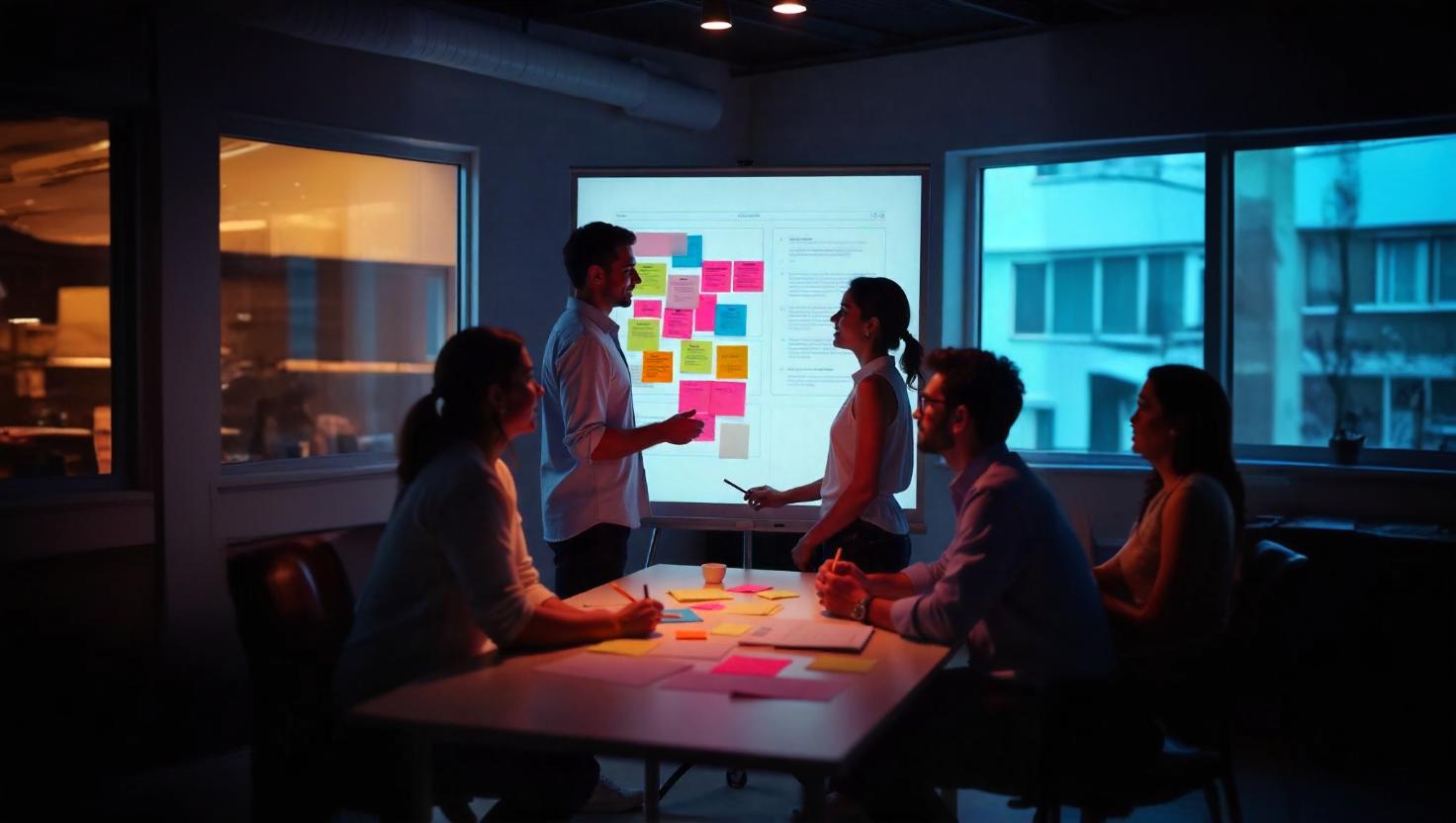
Research
Research
Empathize with Users
Empathize with Users
Designing stunning visuals & Memorable Experiences
“Suddenly, as these persona have originated independently from one another there are variety of different offerings co-existing in a single product”
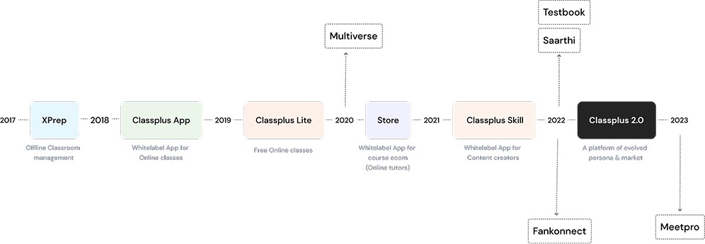
Classplus 1.0
Entangled Information Architecture - tough to self-onboard & navigate different features
Visual inconsistencies in the design throughout the platform
Information overload due to unstructured information and no clear guidelines

Classplus 2.0
Evolving Persona - Classplus 2.0 caters to new age, tech up-to-date content creators. These creators are Online-first - have good social presence, an avg. subscribers size of 20k on Youtube. They use apps/tools like Instamojo, Kajabi, Paytm, Phonepe, etc in their day-to-day life. Classplus 2.0 aims to build a product catering to global audience offering advance digital marketing & analysis tools along with Educational tools to optimise the complete funnel of Content Creators.
Evolving Market - We are also expanding our reach to international audience, based in South Korea, Singapore, Vietnam & Malaysia.
With Classplus 2.0, the aim of the team is to go for Product-Led-Growth i.e, Intuitive IA - Clear hierarchy to ensures smooth navigation, easy to find, easy to use featuresSelf-Education - Contextual Onboarding, feature education, help & support ( a “DIY” product)
“Suddenly, as these persona have originated independently from one another there are variety of different offerings co-existing in a single product”
Classplus 1.0
Entangled Information Architecture - tough to self-onboard & navigate different features
Visual inconsistencies in the design throughout the platform
Information overload due to unstructured information and no clear guidelines
Classplus 2.0
Evolving Persona - Classplus 2.0 caters to new age, tech up-to-date content creators. These creators are Online-first - have good social presence, an avg. subscribers size of 20k on Youtube. They use apps/tools like Instamojo, Kajabi, Paytm, Phonepe, etc in their day-to-day life. Classplus 2.0 aims to build a product catering to global audience offering advance digital marketing & analysis tools along with Educational tools to optimise the complete funnel of Content Creators.
Evolving Market - We are also expanding our reach to international audience, based in South Korea, Singapore, Vietnam & Malaysia.
With Classplus 2.0, the aim of the team is to go for Product-Led-Growth i.e, Intuitive IA - Clear hierarchy to ensures smooth navigation, easy to find, easy to use featuresSelf-Education - Contextual Onboarding, feature education, help & support ( a “DIY” product)
Define
Define
Users' needs and problems
Users' needs and problems
Since it was Design team led Initiative, we didn’t get bandwidth for it. This was how we pulled this off -
Collaboration - work distribution, help-&-support & clear communication
Timely Checkpoints - Friday 5-6pm meeting on work progress
Painpoints of Design team
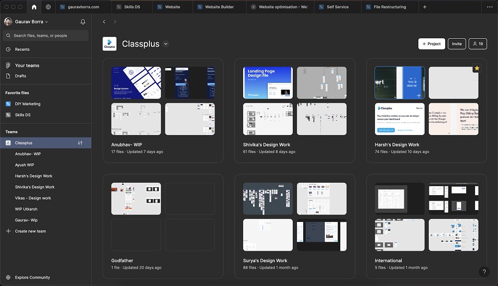
A.) No clear Design file Organisation, Structure, Layout & handoff guidelines
Project names are Team member’s name
Multiple files of a same feature
Multiple enhancement files of a single feature
Multiple features in a same file
Only 1 person knows it all
Every new hire further slows down the process without proper standards in place
B.) No Documentation (single source of truth) to refer to while creating any new design - leading inconsistency in the overall product
100+ shades of grey
9 different primary buttons
Inconsistencies components
C.) Redundancy in Design
every element needs to be built from scratch
D.) Non-Scalable Designs
platform specific components
Since it was Design team led Initiative, we didn’t get bandwidth for it. This was how we pulled this off -
Collaboration - work distribution, help-&-support & clear communication
Timely Checkpoints - Friday 5-6pm meeting on work progress
Painpoints of Design team
A.) No clear Design file Organisation, Structure, Layout & handoff guidelines
Project names are Team member’s name
Multiple files of a same feature
Multiple enhancement files of a single feature
Multiple features in a same file
Only 1 person knows it all
Every new hire further slows down the process without proper standards in place
B.) No Documentation (single source of truth) to refer to while creating any new design - leading inconsistency in the overall product
100+ shades of grey
9 different primary buttons
Inconsistencies components
C.) Redundancy in Design
every element needs to be built from scratch
D.) Non-Scalable Designs
platform specific components
Ideate
Ideate
Solutions
Solutions
Design in Phases
As this is a self-initiated project in collaboration with the whole design team, we concluded this project in 3 phases, with divided responsibilities of each team member
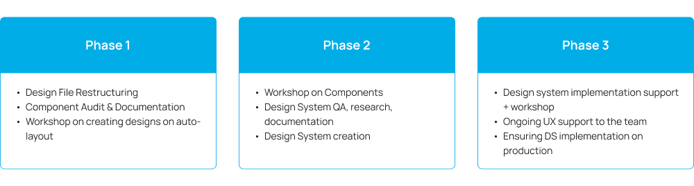
Phase 1 :Files Restructuring
We’ve learnt best industry practises & brainstormed on our usecase to come up with the best strategies
Create a new file
Learnt best Practises to organise a Design file - with details, IA
How to document enhancements
How to look for a design file in future
How to give a decent hand-off
Project Organisation
Verticals into Projects
Base file of a main feature
All Enhancements in the base file
New Features in new file with a link to base file


Project Organisation
Verticals into Projects
Base file of a main feature
All Enhancements in the base file\
New Features in new file with a link to base file

Phase 2 :Design System
Empowering Design team
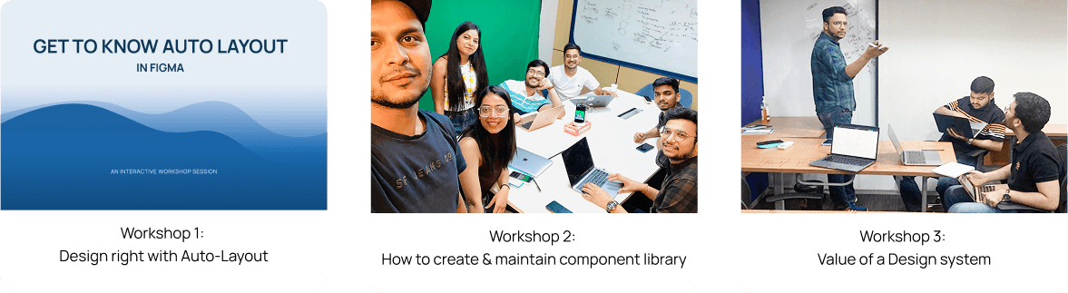
As the inconsistency was throughout the product, we’re needed to create a complete Design system for Classplus 2.0 at the very early stage to support scalability, consistency and re-usability. I took sessions on Auto-layout, Design system to create Design guidelines & learn best practises and brainstormed on approach - how to document, implement & maintain design system.
Design in Phases
As this is a self-initiated project in collaboration with the whole design team, we concluded this project in 3 phases, with divided responsibilities of each team member
Phase 1 :Files Restructuring
We’ve learnt best industry practises & brainstormed on our usecase to come up with the best strategies
Create a new file
Learnt best Practises to organise a Design file - with details, IA
How to document enhancements
How to look for a design file in future
How to give a decent hand-off
Project Organisation
Verticals into Projects
Base file of a main feature
All Enhancements in the base file
New Features in new file with a link to base file
Project Organisation
Verticals into Projects
Base file of a main feature
All Enhancements in the base file\
New Features in new file with a link to base file
Phase 2 :Design System
Empowering Design team
As the inconsistency was throughout the product, we’re needed to create a complete Design system for Classplus 2.0 at the very early stage to support scalability, consistency and re-usability. I took sessions on Auto-layout, Design system to create Design guidelines & learn best practises and brainstormed on approach - how to document, implement & maintain design system.
FINAL
Designs
Hi- Fidelity
Hi- Fidelity
Design Mocks
Design Mocks
Design Language System
A design system is a set of standards to manage design at scale by reducing redundancy while creating a shared language and visual consistency across different pages and channels.
Principles
Following principles will act as a foundation for the Design System & as a guidance light whenever you have multiple ideas and need a decision factor. All 6 principles are crafted from existing design considering various factors - making this practical, realistic & effective.

Style Guide
The Style Guide establishes the root for visual presentations and a design system connects components, patterns, and visuals together to become one single source of truth for products and brands.
Color Pallete

Shadows & Elevations
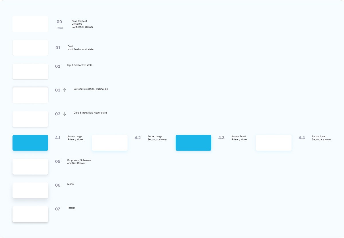
Typography

Methodology : Atomic
The Atomic Design methodology created by Brad Frost is a design methodology for crafting robust design systems with explicit order and hierarchy. As the name suggests, it’s derived from a basic chemistry concept: the composition of all matter. To understand atomic design better, we’ll need to brush up on some basic chemistry concepts quickly.

Atoms
If atoms are the basic building blocks of matter, then the atoms of our interfaces serve as the foundational building blocks that comprise all our user interfaces. These atoms include basic HTML elements like form labels, inputs, buttons, and others that can’t be broken down any further without ceasing to be functional.

Molecule
molecules are relatively simple groups of UI elements functioning together as a unit. For example, a form label, search input, and button can join together to create a search form molecule.

Compound
Compounds are relatively complex UI components composed of groups of molecules and/or atoms and/or other organisms. These organisms form distinct sections of an interface.

Layouts
Layouts are page-level objects that place components into a layout and articulate the design’s underlying content structure. To build on our previous example, we can take the header organism and apply it to a homepage template.

Pages
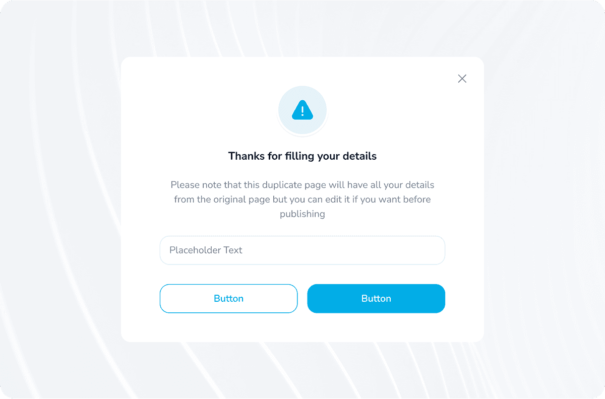
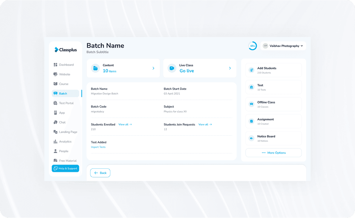
Pages are specific instances of templates that show what a UI looks like with real representative content in place. Building on our previous example, we can take the homepage template and pour representative text, images, and media into the template to show real content in action.
Phase 3:
Design system implementation
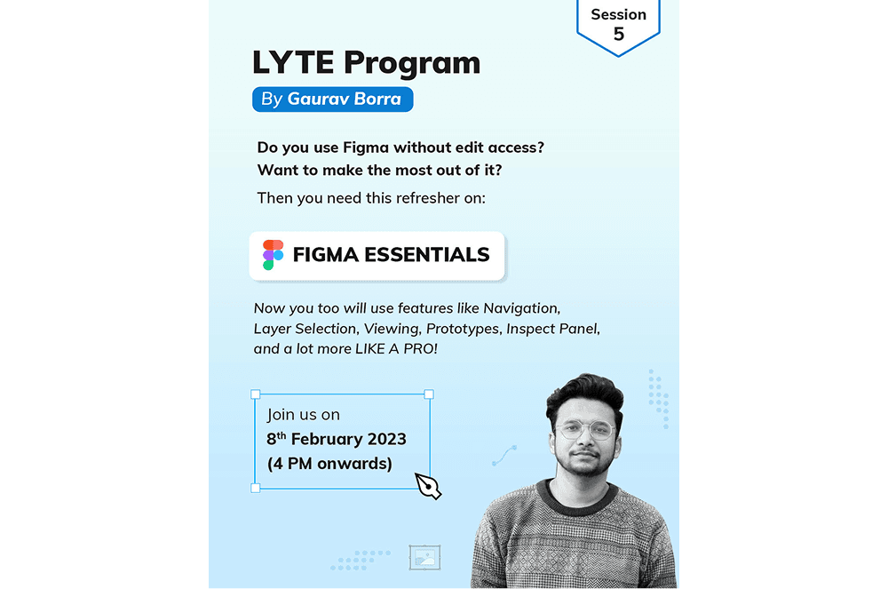
To setup the behaviour of following a proper design system company-wide, we also took sessions with the Devs to learn figma
DS prioritisation in task list to ensure Design system implementation on production
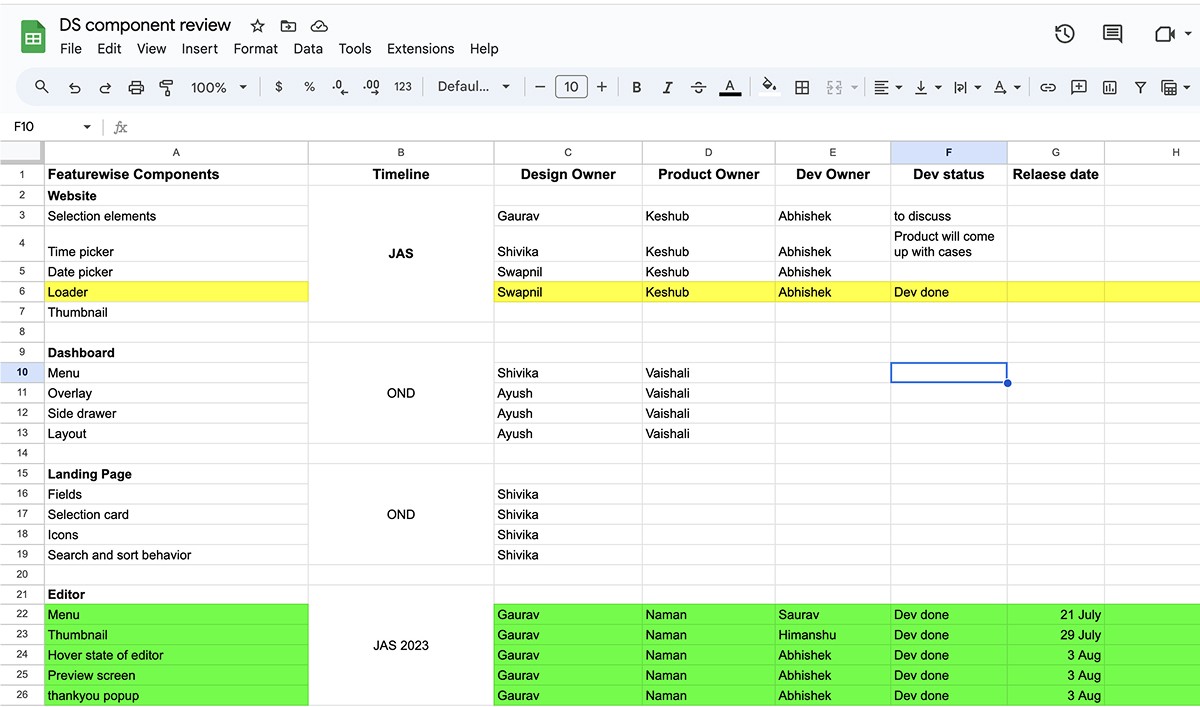
In order to track and communicate the progress of the different steps, we created a spreadsheet that can be viewed and updated both by design and development. We create Debt list for all components that link out to all the relevant documentation and move them to corresponding status columns (In Design, Needs Feedback, In Development, etc.) throughout the process.
Component UAT
To ensure the quality of design on production

Design Language System
A design system is a set of standards to manage design at scale by reducing redundancy while creating a shared language and visual consistency across different pages and channels.
Principles
Following principles will act as a foundation for the Design System & as a guidance light whenever you have multiple ideas and need a decision factor. All 6 principles are crafted from existing design considering various factors - making this practical, realistic & effective.
Style Guide
The Style Guide establishes the root for visual presentations and a design system connects components, patterns, and visuals together to become one single source of truth for products and brands.
Color Pallete
Shadows & Elevations
Typography
Methodology : Atomic
The Atomic Design methodology created by Brad Frost is a design methodology for crafting robust design systems with explicit order and hierarchy. As the name suggests, it’s derived from a basic chemistry concept: the composition of all matter. To understand atomic design better, we’ll need to brush up on some basic chemistry concepts quickly.
Atoms
If atoms are the basic building blocks of matter, then the atoms of our interfaces serve as the foundational building blocks that comprise all our user interfaces. These atoms include basic HTML elements like form labels, inputs, buttons, and others that can’t be broken down any further without ceasing to be functional.
Molecule
molecules are relatively simple groups of UI elements functioning together as a unit. For example, a form label, search input, and button can join together to create a search form molecule.
Compound
Compounds are relatively complex UI components composed of groups of molecules and/or atoms and/or other organisms. These organisms form distinct sections of an interface.
Layouts
Layouts are page-level objects that place components into a layout and articulate the design’s underlying content structure. To build on our previous example, we can take the header organism and apply it to a homepage template.
Pages
Pages are specific instances of templates that show what a UI looks like with real representative content in place. Building on our previous example, we can take the homepage template and pour representative text, images, and media into the template to show real content in action.
Phase 3:
Design system implementation
To setup the behaviour of following a proper design system company-wide, we also took sessions with the Devs to learn figma
DS prioritisation in task list to ensure Design system implementation on production
In order to track and communicate the progress of the different steps, we created a spreadsheet that can be viewed and updated both by design and development. We create Debt list for all components that link out to all the relevant documentation and move them to corresponding status columns (In Design, Needs Feedback, In Development, etc.) throughout the process.
Component UAT
To ensure the quality of design on production
SHOWReel

IMPACT &
Outcome
Impact
Impact
Created
Created