
SuperPass Live
How a 375+ exam subscription evolved from mandate acquisition to meaningful trial activation
SuperPass Live
How a 375+ exam subscription evolved from mandate acquisition to meaningful trial activation
For
Testbook
Role
Lead Product Designer
Timeframe
Multi-phase product evolution
Tool Used
Figma, Product Analytics
SuperPass Live
How a 375+ exam subscription evolved from mandate acquisition to meaningful trial activation
For
Testbook
Role
Lead Product Designer
Timeframe
Multi-phase product evolution
Tool Used
Figma, Product Analytics
PROJECT
Overview
Overview
Overview
SuperPass promised something powerful: one subscription for learning and assessment across 375+ government exams.But a promise this broad created two different problems. Before purchase, we had to help an aspirant believe SuperPass was relevant to their goal. After mandate signing, we had to help them find a useful place to begin.This is the story of improving the first number, then realising we had moved the harder problem downstream.
SuperPass promised something powerful: one subscription for learning and assessment across 375+ government exams. But a promise this broad created two different problems. Before purchase, we had to help an aspirant believe SuperPass was relevant to their goal. After mandate signing, we had to help them find a useful place to begin. This is the story of improving the first number, then realising we had moved the harder problem downstream.
SuperPass promised something powerful: one subscription for learning and assessment across 375+ government exams.But a promise this broad created two different problems. Before purchase, we had to help an aspirant believe SuperPass was relevant to their goal. After mandate signing, we had to help them find a useful place to begin.This is the story of improving the first number, then realising we had moved the harder problem downstream.
Approach
Approach
I stopped treating mandate acquisition and post-purchase activation as separate design problems.
Instead, I followed the subscription as one system: from the promise that earned the mandate, to the first learning experience that had to justify keeping it.
Broad access was the value proposition.
A focused starting point had to become the experience.
Problem
Statement
Problem
Statement
The ₹1 trial and Autopay journey made SuperPass easier to enter, but signing a mandate was only an indication of intent—not a profitable conversion.
For the subscription model to work, users needed to remain active for at least two paid cycles. However, after signing the mandate, they entered an experience crowded with courses, live classes, tests, notes and practice material across multiple exams. There was no clear path to the most relevant course or learning activity.
Users had access to everything, but insufficient guidance on where to begin. If they failed to discover value during the trial or first subscription cycle, they could cancel before the business recovered the value expected from the subscription.
SuperPass could win the mandate in minutes, but its economics depended on earning the user’s next six months.
Challenges
Challenges
How might we preserve access across 375+ exams, while helping every new trial user choose one relevant exam, enter one relevant course and begin learning without feeling lost?
How might we preserve access across 375+ exams, while helping every new trial user choose one relevant exam, enter one relevant course and begin learning without feeling lost?
DESIGN
PROCESS
Process
Process
followed
followed
This was not a clean, linear redesign.
It was the evolution of a subscription system—moving back and forth between acquisition and activation as each improvement exposed the next problem.
The promise was bigger than the product model
Testbook already had an assessment Pass that gave learners access across multiple exams.
Learning subscriptions worked differently. They were organised around a single exam, even though government-exam aspirants rarely prepare for only one. Their preparation overlaps across roles, boards and exam families.
SuperPass Live was meant to close that gap: one learning and assessment subscription across 375+ exams (300+ exams initially).
The business proposition changed from buy a course for an exam to buy access for your preparation journey.
The product experience had not yet caught up with that promise.
V1–V3: proving that people wanted SuperPass
The first three versions established the purchase-side baseline. I provided design direction across this evolution, while later phases became my direct focus.
V1 validated the proposition.
We used existing Super Coaching patterns to launch quickly and learn whether aspirants understood the value of one subscription across exams.
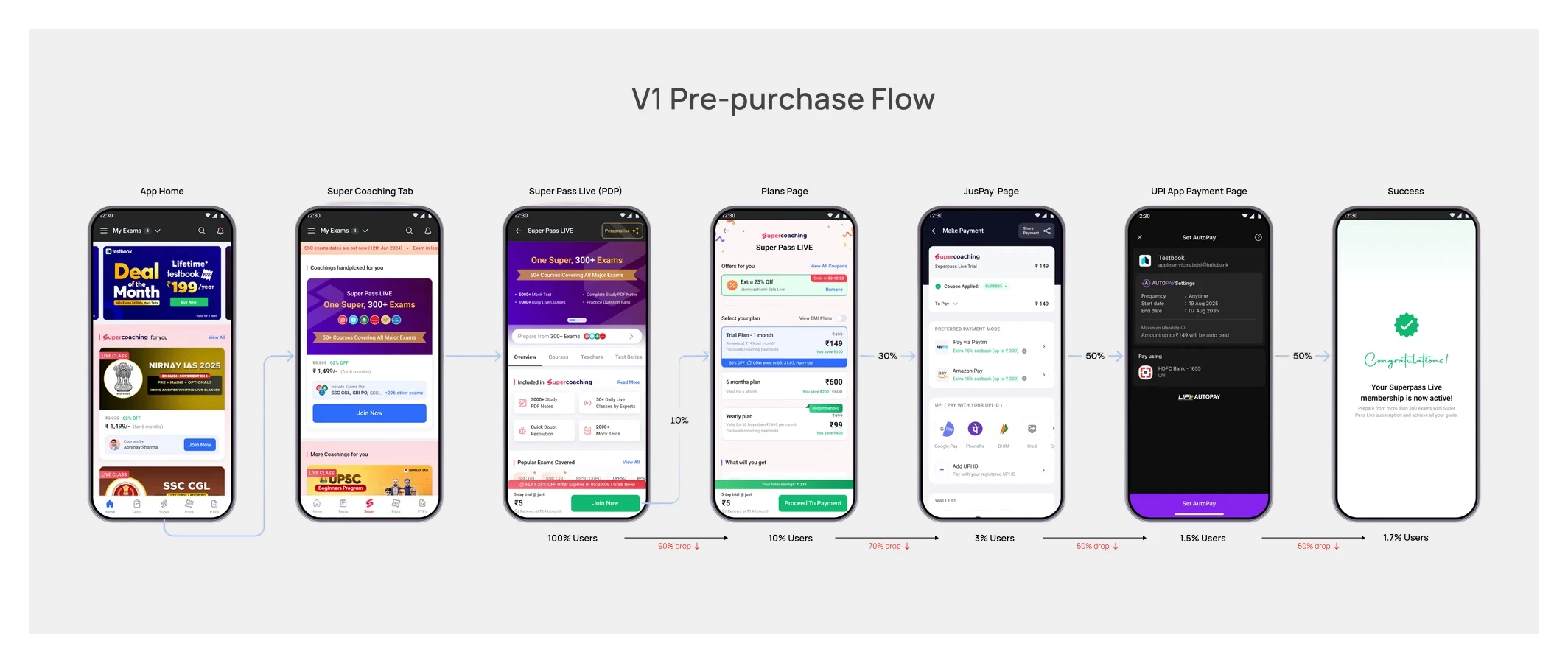
V2 gave SuperPass its own destination.
A dedicated tab and product page made the offer easier to discover and explain.
V3 reduced the commitment required to try it.
We introduced a ₹1 trial with UPI Autopay and simplified mandate signing.
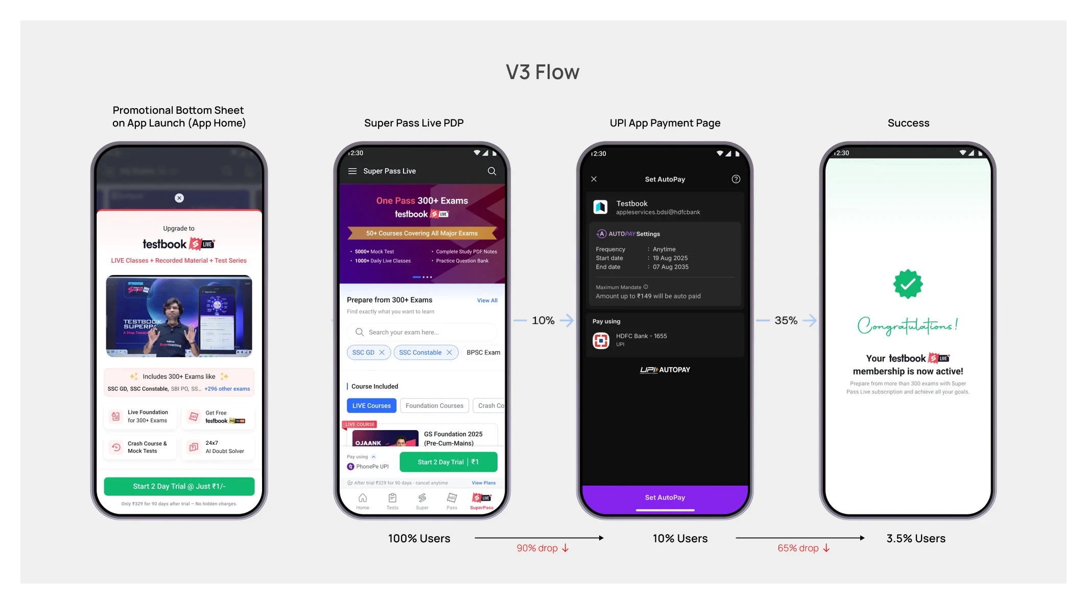
Together, these versions helped users reach the trial. But they still assumed that once someone entered SuperPass, the breadth of content would sell itself.
V4:Moving content discovery inside the trial
V3 had already improved conversion through the ₹1 trial and UPI Autopay. In V4, we explored whether conversion could improve further
Before starting a trial, a free user could move through course pages, tests, notes and other content previews. Every additional branch created another place to hesitate or drop.
My hypothesis was that we did not need to explain the entire catalogue before the trial. The ₹1 trial could itself become the environment in which users discovered the content.
We first tested this on mobile web. When a user tried to access relevant learning content, we presented a focused SuperPass trial prompt instead of sending them through more catalogue exploration.
Mandate signing improved, so we adapted the approach for the main app.
It looked like a success.
Then the cancellations continued.
We solved entry, but moved the problem downstream
A signed mandate was not the same as a paid subscription.
Users still had the trial period to decide whether SuperPass was useful. They could cancel before the full amount was charged.
That distinction changed the question.
The problem was no longer only, How do we get more users to start the trial?
It became, What happens after they do?
Auditing the first experience after mandate signing
The existing SuperPass experience had been built on top of the Super Coaching architecture.
That inheritance created three structural problems.
First, access looked smaller than it was.
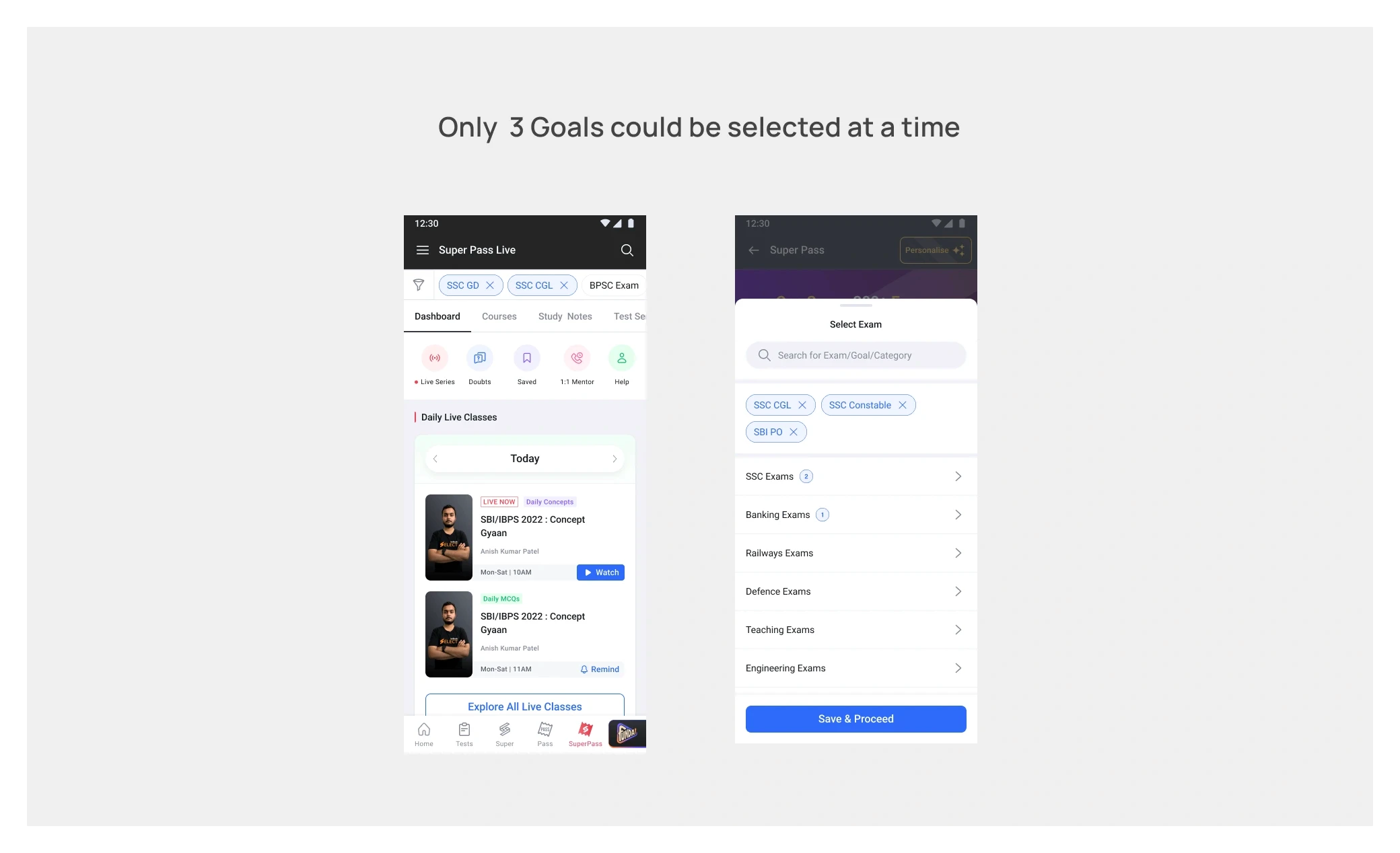
SuperPass covered 375+ exams, but a user could select only three goals at a time. The constraint existed for valid performance and content-load reasons, yet the interface could easily suggest that the subscription itself was limited to those three exams.
Second, everything competed at the same level.
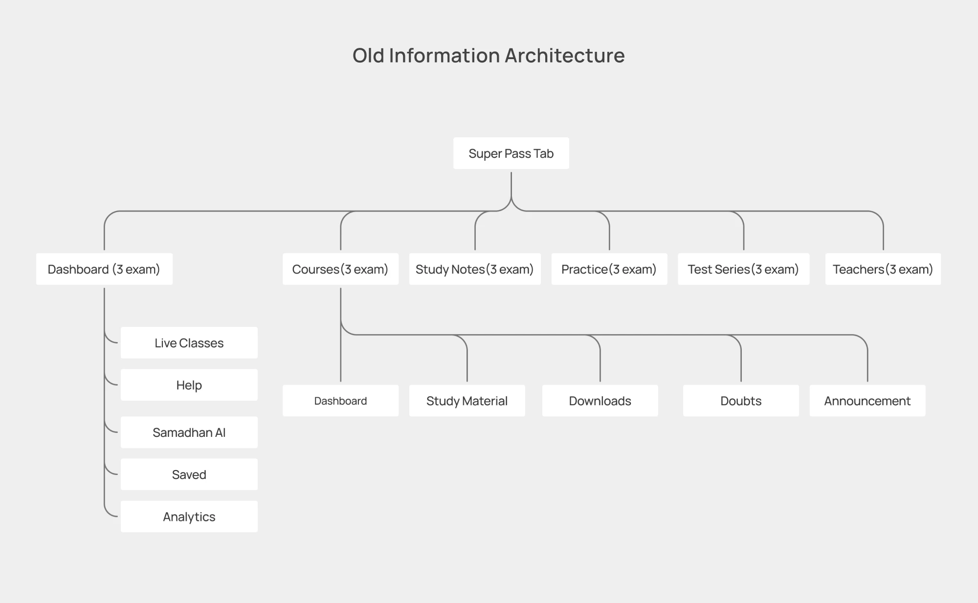
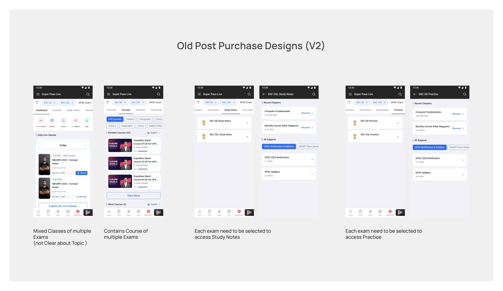
The SuperPass home mixed courses, live classes, tests, study notes, practice, previous-year papers and utility or promotional modules. There was plenty to use, but no dominant answer to: What should I do first?
Third, relevance was inferred from weak signals.
We automatically enrolled users into courses using their pre-purchase journey and selected goals. But goal selection by a free user was not always deliberate. Users were sometimes promoted into the tab, and the three-goal limit meant those choices could be exploratory rather than a reliable statement of intent.
My hypothesis was that trial users were not cancelling because SuperPass lacked content. They were cancelling before they could find a relevant course and experience its value.
The data changed the shape of the problem
I worked with the Data team to connect the mandate funnel with what users actually did after signing.
We looked at goal selection and enrolment, course-page visits, auto-enrolled versus self-selected courses, and learning activity such as videos, tests, live classes, practice and notes across cancelled and renewed users.
One signal stood out in a cohort of 24,198 users:
Users were enrolled into an average of 3.6 courses after signing the mandate.
They explored an average of only 0.9 course modules.
We had solved availability.
We had not solved discovery.
The data did not prove that navigation alone caused cancellation. But it was strong evidence that automatic enrolment and a large catalogue were not translating into meaningful exploration.
Reframing the experience around one useful beginning
The redesign started with a distinction that became central to the project:
SuperPass should remain global at the entitlement level, but become focused at the experience level.
Instead of asking a new subscriber to make sense of the entire catalogue, we would first establish a trusted context: the exam they were preparing for, their preparation level and their preferred language.
This contextual onboarding appeared immediately after mandate signing. It was intentionally lightweight, and every choice could be changed later.
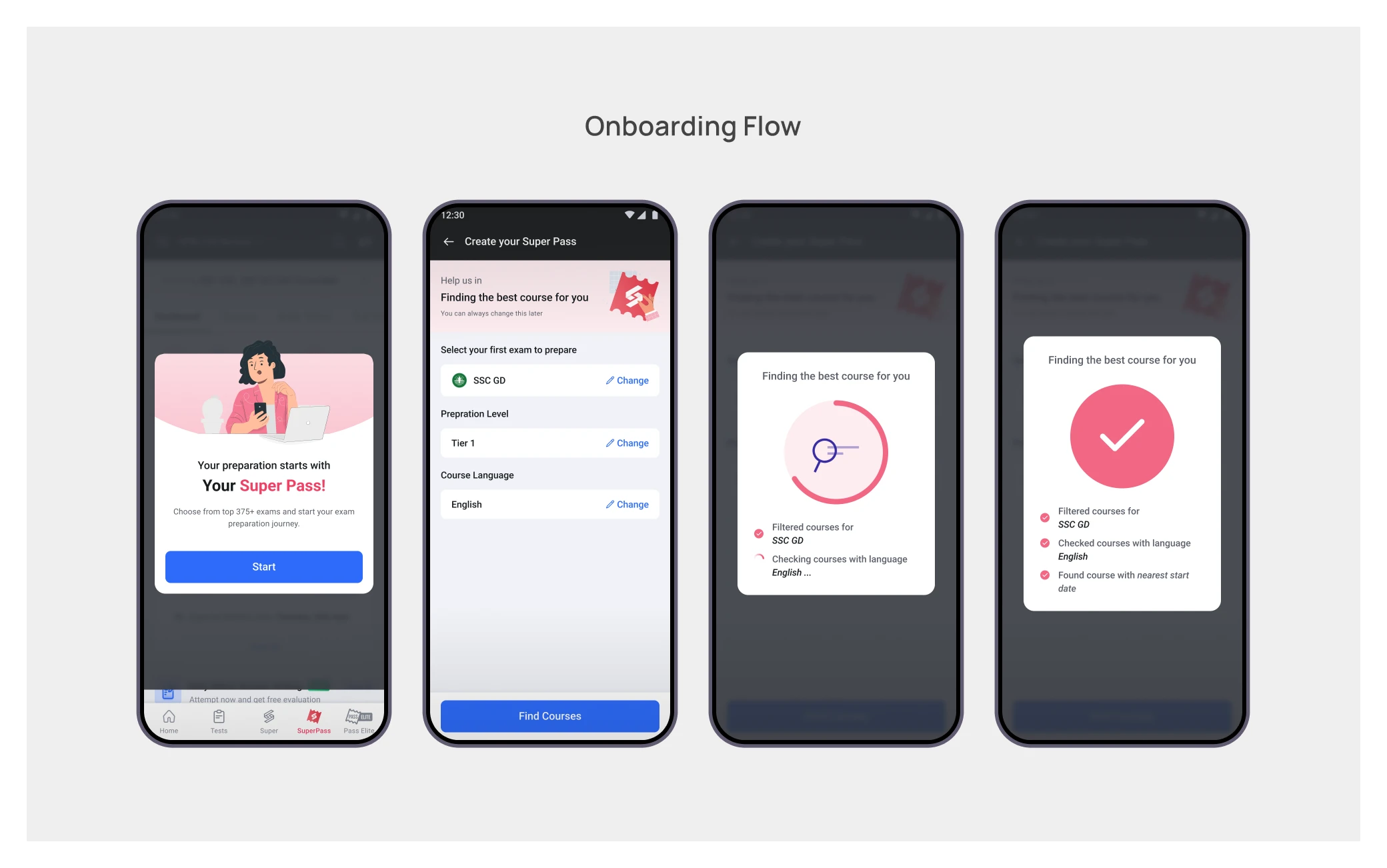
The matching logic then used exam, language and the nearest relevant start date to recommend a course—not one course per loosely selected goal, but one credible place to begin.
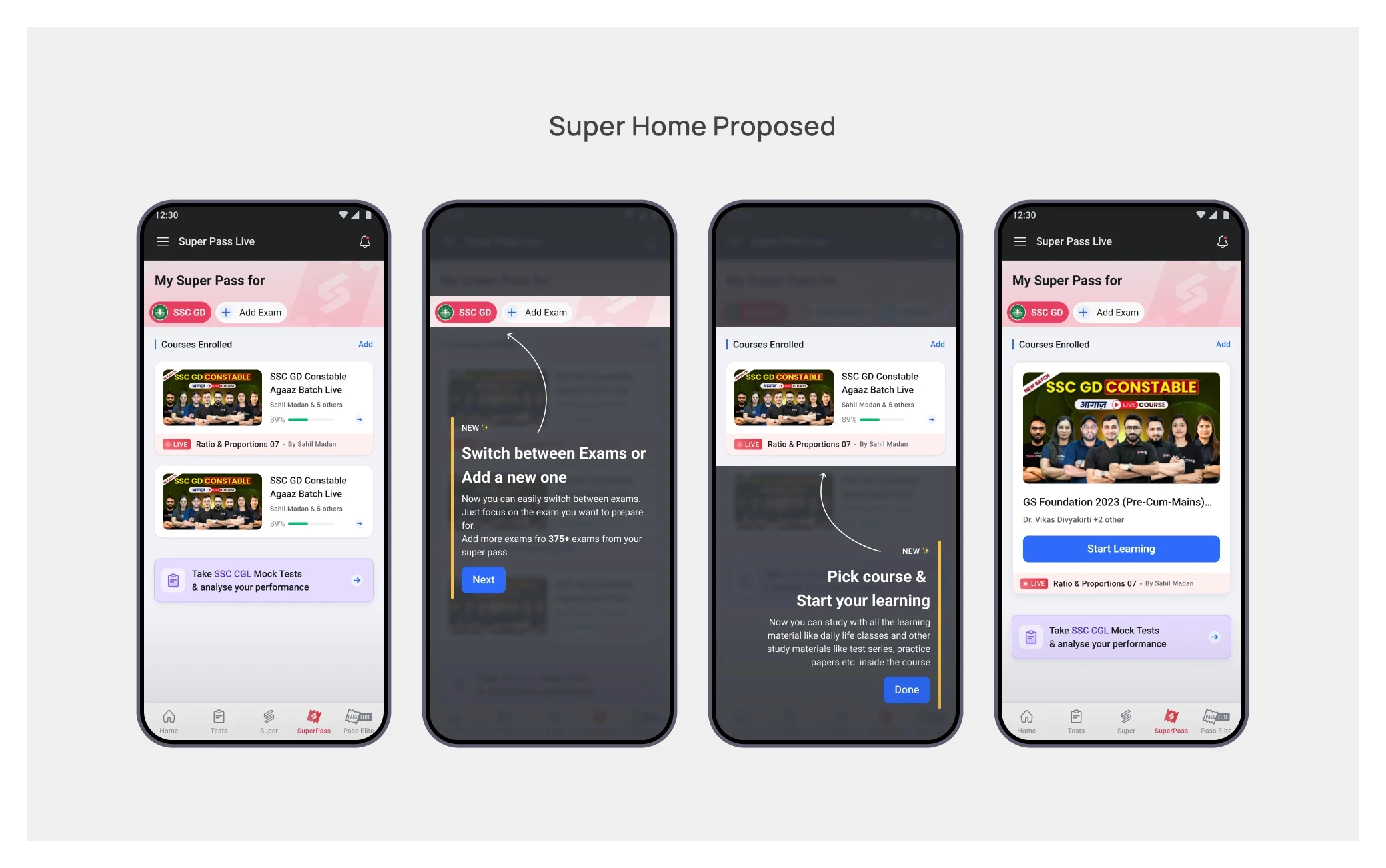
The SuperPass home became exam-focused. The active exam was explicit, switching or adding an exam remained easy, and courses became the hero instead of one more item in a crowded grid.
Phase 1: change the entry without breaking the product
The complete architecture could not be replaced in one release. Existing systems and learning entry points still had to work while the deeper course structure was being redesigned.
So the first implementation focused on the highest-leverage transition:
Contextual onboarding after mandate signing
An explicit active exam
A relevant course recommendation
An exam-focused SuperPass home with courses prioritised
Test Series, Study Notes, Practice and Teachers stayed accessible under Other Offerings. The existing course architecture also remained intact.
This was a deliberate bridge: users gained a clearer starting point without losing familiar ways to reach study material.

Phase 2: the complete course-first vision
Phase 2 was the final architecture I designed for the problem.
The hierarchy moved from a flat collection of resources to a learning context:
SuperPass → Active Exam → Selected Course → Schedule, Subjects, Tests, PYPs and Notes
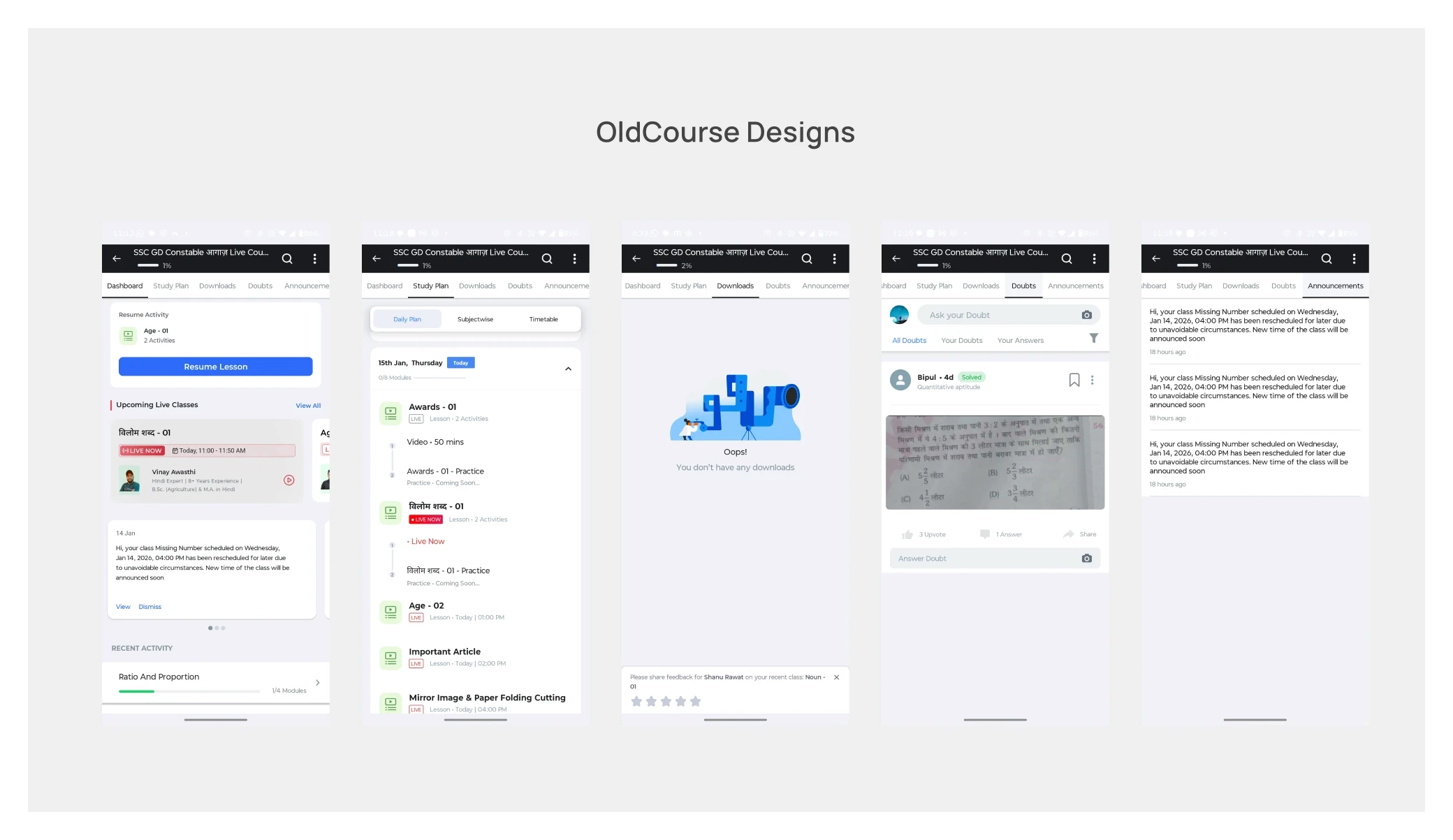
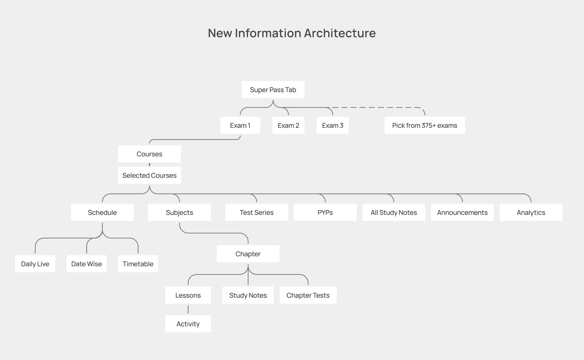
Inside the course, learners could move through a daily or date-wise schedule, a subject-to-chapter-to-lesson hierarchy, course-linked tests and previous-year papers, and the notes or resources attached to what they were studying.
The course was no longer just another card. It became the organising object for the entire preparation experience.
This phase was fully designed but has not been implemented.
I do not attribute retention or renewal outcomes to it.
Returning to acquisition—with a sharper message
Later, we revisited mandate acquisition through a dedicated app built around a single-page SuperPass pitch.
The regular app was converting roughly 10% of Goal Page Visits into mandates. The first dedicated-app experience reached roughly 27%.
We then tested what information genuinely helped a user decide. The page stopped trying to explain the entire product and focused only on what was relevant to the selected goal. The message shifted from a list of features to the learner's aspiration and preparation outcome.
Goal Page Visit-to-mandate conversion subsequently reached roughly 34%.
These numbers describe mandate acquisition, not successful trial-to-paid conversion. Because the regular and dedicated app contexts may also differ, I treat the comparison as directional evidence rather than assigning the entire uplift to page design alone.
What this project changed for me
The most important design decision was not a screen or component. It was redefining the unit of the experience.
At the business level, SuperPass needed to feel unlimited.
At the user level, it needed to feel specific.
The work also made one product lesson impossible to ignore: acquisition and retention are not separate funnels. A local conversion win can hide a system failure if the next experience cannot fulfil the promise that created the conversion.
More mandates did not mean more subscribers.
The subscription only became real when a learner found a course worth continuing.
This was not a clean, linear redesign.
It was the evolution of a subscription system—moving back and forth between acquisition and activation as each improvement exposed the next problem.
The promise was bigger than the product model
Testbook already had an assessment Pass that gave learners access across multiple exams.
Learning subscriptions worked differently. They were organised around a single exam, even though government-exam aspirants rarely prepare for only one. Their preparation overlaps across roles, boards and exam families.
SuperPass Live was meant to close that gap: one learning and assessment subscription across 375+ exams (300+ exams initially).
The business proposition changed from buy a course for an exam to buy access for your preparation journey.
The product experience had not yet caught up with that promise.
V1–V3: proving that people wanted SuperPass
The first three versions established the purchase-side baseline. I provided design direction across this evolution, while later phases became my direct focus.
V1 validated the proposition.
We used existing Super Coaching patterns to launch quickly and learn whether aspirants understood the value of one subscription across exams.
V2 gave SuperPass its own destination.
A dedicated tab and product page made the offer easier to discover and explain.
V3 reduced the commitment required to try it.
We introduced a ₹1 trial with UPI Autopay and simplified mandate signing.
Together, these versions helped users reach the trial. But they still assumed that once someone entered SuperPass, the breadth of content would sell itself.
V4:Moving content discovery inside the trial
V3 had already improved conversion through the ₹1 trial and UPI Autopay. In V4, we explored whether conversion could improve further
Before starting a trial, a free user could move through course pages, tests, notes and other content previews. Every additional branch created another place to hesitate or drop.
My hypothesis was that we did not need to explain the entire catalogue before the trial. The ₹1 trial could itself become the environment in which users discovered the content.
We first tested this on mobile web. When a user tried to access relevant learning content, we presented a focused SuperPass trial prompt instead of sending them through more catalogue exploration.
Mandate signing improved, so we adapted the approach for the main app.
It looked like a success.
Then the cancellations continued.
We solved entry, but moved the problem downstream
A signed mandate was not the same as a paid subscription.
Users still had the trial period to decide whether SuperPass was useful. They could cancel before the full amount was charged.
That distinction changed the question.
The problem was no longer only, How do we get more users to start the trial?
It became, What happens after they do?
Auditing the first experience after mandate signing
The existing SuperPass experience had been built on top of the Super Coaching architecture.
That inheritance created three structural problems.
First, access looked smaller than it was.
SuperPass covered 375+ exams, but a user could select only three goals at a time. The constraint existed for valid performance and content-load reasons, yet the interface could easily suggest that the subscription itself was limited to those three exams.
Second, everything competed at the same level.
The SuperPass home mixed courses, live classes, tests, study notes, practice, previous-year papers and utility or promotional modules. There was plenty to use, but no dominant answer to: What should I do first?
Third, relevance was inferred from weak signals.
We automatically enrolled users into courses using their pre-purchase journey and selected goals. But goal selection by a free user was not always deliberate. Users were sometimes promoted into the tab, and the three-goal limit meant those choices could be exploratory rather than a reliable statement of intent.
My hypothesis was that trial users were not cancelling because SuperPass lacked content. They were cancelling before they could find a relevant course and experience its value.
The data changed the shape of the problem
I worked with the Data team to connect the mandate funnel with what users actually did after signing.
We looked at goal selection and enrolment, course-page visits, auto-enrolled versus self-selected courses, and learning activity such as videos, tests, live classes, practice and notes across cancelled and renewed users.
One signal stood out in a cohort of 24,198 users:
Users were enrolled into an average of 3.6 courses after signing the mandate.
They explored an average of only 0.9 course modules.
We had solved availability.
We had not solved discovery.
The data did not prove that navigation alone caused cancellation. But it was strong evidence that automatic enrolment and a large catalogue were not translating into meaningful exploration.
Reframing the experience around one useful beginning
The redesign started with a distinction that became central to the project:
SuperPass should remain global at the entitlement level, but become focused at the experience level.
Instead of asking a new subscriber to make sense of the entire catalogue, we would first establish a trusted context: the exam they were preparing for, their preparation level and their preferred language.
This contextual onboarding appeared immediately after mandate signing. It was intentionally lightweight, and every choice could be changed later.
The matching logic then used exam, language and the nearest relevant start date to recommend a course—not one course per loosely selected goal, but one credible place to begin.
The SuperPass home became exam-focused. The active exam was explicit, switching or adding an exam remained easy, and courses became the hero instead of one more item in a crowded grid.
Phase 1: change the entry without breaking the product
The complete architecture could not be replaced in one release. Existing systems and learning entry points still had to work while the deeper course structure was being redesigned.
So the first implementation focused on the highest-leverage transition:
Contextual onboarding after mandate signing
An explicit active exam
A relevant course recommendation
An exam-focused SuperPass home with courses prioritised
Test Series, Study Notes, Practice and Teachers stayed accessible under Other Offerings. The existing course architecture also remained intact.
This was a deliberate bridge: users gained a clearer starting point without losing familiar ways to reach study material.
Phase 2: the complete course-first vision
Phase 2 was the final architecture I designed for the problem.
The hierarchy moved from a flat collection of resources to a learning context:
SuperPass → Active Exam → Selected Course → Schedule, Subjects, Tests, PYPs and Notes
Inside the course, learners could move through a daily or date-wise schedule, a subject-to-chapter-to-lesson hierarchy, course-linked tests and previous-year papers, and the notes or resources attached to what they were studying.
The course was no longer just another card. It became the organising object for the entire preparation experience.
This phase was fully designed but has not been implemented.
I do not attribute retention or renewal outcomes to it.
Returning to acquisition—with a sharper message
Later, we revisited mandate acquisition through a dedicated app built around a single-page SuperPass pitch.
The regular app was converting roughly 10% of Goal Page Visits into mandates. The first dedicated-app experience reached roughly 27%.
We then tested what information genuinely helped a user decide. The page stopped trying to explain the entire product and focused only on what was relevant to the selected goal. The message shifted from a list of features to the learner's aspiration and preparation outcome.
Goal Page Visit-to-mandate conversion subsequently reached roughly 34%.
These numbers describe mandate acquisition, not successful trial-to-paid conversion. Because the regular and dedicated app contexts may also differ, I treat the comparison as directional evidence rather than assigning the entire uplift to page design alone.
What this project changed for me
The most important design decision was not a screen or component. It was redefining the unit of the experience.
At the business level, SuperPass needed to feel unlimited.
At the user level, it needed to feel specific.
The work also made one product lesson impossible to ignore: acquisition and retention are not separate funnels. A local conversion win can hide a system failure if the next experience cannot fulfil the promise that created the conversion.
More mandates did not mean more subscribers.
The subscription only became real when a learner found a course worth continuing.
FINAL
Designs
Hi- Fidelity
Hi- Fidelity
Design Mocks
Design Mocks
Prototype
Prototype

IMPACT &
Outcome
Impact
Impact
Created
Created
The measurable outcome came from the acquisition experience:
Testbook app after V4: approximately 11% GPV-to-mandate conversion
Initial dedicated app: approximately 27%
Optimised, aspiration-led experience: approximately 34% currently
The dedicated app therefore achieved roughly 3× the mandate conversion observed on the Testbook app after V4.
On the post-purchase side, contextual onboarding and the exam-focused SuperPass home shipped in Phase 1. The complete course-first architecture was designed in Phase 2 but remains unimplemented, so no retention or renewal impact is attributed to it.
The larger outcome was a clearer product model: broad access at the subscription level, focused relevance at the moment of use.