Simplifying Onboarding
Simplified login and signup to reduce drop-offs
Simplifying Onboarding
Simplified login and signup to reduce drop-offs
For
Testbook
Role
Lead Product Designer
Timeframe
2 weeks
Tool Used
Figma
Simplifying Onboarding
Simplified login and signup to reduce drop-offs
For
Testbook
Role
Lead Product Designer
Timeframe
2 weeks
Tool Used
Figma
PROJECT
Overview
Overview
Overview
When users install Testbook, they come with a clear intent — to start learning.But our onboarding experience was getting in the way.Despite strong acquisition, a significant number of users were dropping off before completing signup. The flow relied on manual inputs and OTP verification, creating friction at the very first interaction.What started as a conversion problem soon revealed something deeper —we weren’t just optimizing a flow, we were challenging how authentication should work.
When users install Testbook, they come with a clear intent — to start learning. But our onboarding experience was getting in the way. Despite strong acquisition, a significant number of users were dropping off before completing signup. The flow relied on manual inputs and OTP verification, creating friction at the very first interaction. What started as a conversion problem soon revealed something deeper — we weren’t just optimizing a flow, we were challenging how authentication should work.
When users install Testbook, they come with a clear intent — to start learning.But our onboarding experience was getting in the way.Despite strong acquisition, a significant number of users were dropping off before completing signup. The flow relied on manual inputs and OTP verification, creating friction at the very first interaction.What started as a conversion problem soon revealed something deeper —we weren’t just optimizing a flow, we were challenging how authentication should work.
Approach
Approach
Redesign driven by data-backed insights, iterative prototyping, and collaboration across teams. Goal was to merge login/signup into one unified flow, optimize for speed and clarity, and ensure resilience across edge cases.
Problem
Statement
Problem
Statement
The onboarding required users to:
Choose between login and signup
Enter their phone number manually
Tap “Continue”
Enter OTP
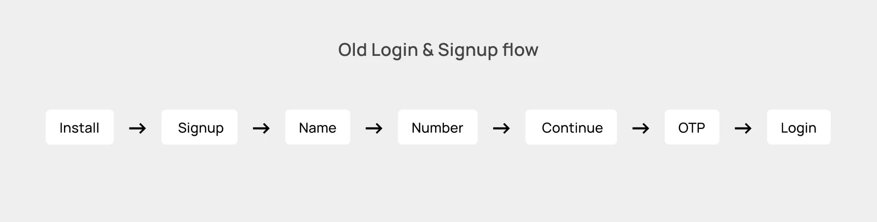
Each step added friction and uncertainty.
Users don’t think in terms of login vs signup — they just want access.
The challenge was to reduce friction and improve Install → Signup conversion, without compromising reliability.
The onboarding required users to:
Choose between login and signup
Enter their phone number manually
Tap “Continue”
Enter OTP
Each step added friction and uncertainty.
Users don’t think in terms of login vs signup — they just want access.
The challenge was to reduce friction and improve Install → Signup conversion, without compromising reliability.
Challenges
Challenges
High drop-offs between install and OTP verification; Complex flow with multiple screens; Maintaining tracking consistency; Ensuring fallback mechanisms for different number-fetch sources; Designing backend-controlled dynamic hero banners without adding load time.
High drop-offs between install and OTP verification; Complex flow with multiple screens; Maintaining tracking consistency; Ensuring fallback mechanisms for different number-fetch sources; Designing backend-controlled dynamic hero banners without adding load time.
DESIGN
PROCESS
Research
Research
Empathize with Users
Empathize with Users
Designing stunning visuals & Memorable Experiences
Funnel data showed a clear drop-off during:
Number entry
OTP verification
But the deeper insight came from behavioral patterns and benchmarking.
While analyzing onboarding flows of leading apps, one thing stood out:
Some apps didn’t feel like they had a signup flow at all.
Platforms like Meesho enabled users to enter seamlessly, without visible OTP friction.
This led to exploring newer authentication methods —
which introduced us to Silent Network Authentication (SNA) via OTPless.
Funnel data showed a clear drop-off during:
Number entry
OTP verification
But the deeper insight came from behavioral patterns and benchmarking.
While analyzing onboarding flows of leading apps, one thing stood out:
Some apps didn’t feel like they had a signup flow at all.
Platforms like Meesho enabled users to enter seamlessly, without visible OTP friction.
This led to exploring newer authentication methods —
which introduced us to Silent Network Authentication (SNA) via OTPless.
Define
Define
Users' needs and problems
Users' needs and problems
The biggest friction wasn’t UI complexity — it was the expectation of manual authentication itself.
This shifted our thinking from:
“How do we improve OTP?”
to:
“How do we remove OTP from the user experience?”
The analysis led us to define our core problems as:
Too many steps between install and verification.
Redundant Signup flow for new user
Redundant input and action requirements (Continue button, manual OTP).
Lack of contextual clarity — users unsure if they were signing up or logging in.
Missed opportunity to use available autofill tools (Truecaller, Dialer)
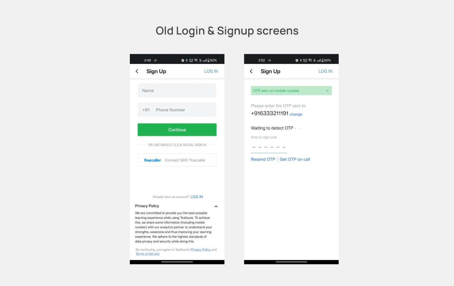
The biggest friction wasn’t UI complexity — it was the expectation of manual authentication itself.
This shifted our thinking from:
“How do we improve OTP?”
to:
“How do we remove OTP from the user experience?”
The analysis led us to define our core problems as:
Too many steps between install and verification.
Redundant Signup flow for new user
Redundant input and action requirements (Continue button, manual OTP).
Lack of contextual clarity — users unsure if they were signing up or logging in.
Missed opportunity to use available autofill tools (Truecaller, Dialer)
Ideate
Ideate
Solutions
Solutions
We reframed onboarding as:
A single, uninterrupted interaction between user intent and access
Instead of optimizing individual steps, we explored ways to eliminate friction across the entire experience.
Design Decisions
This led to a few key decisions:
Unified Login & Signup
Removed the distinction — users enter their number, system handles the restIntroduced SNA (OTPless)
Enabled silent, background authentication without OTPLayered Authentication System
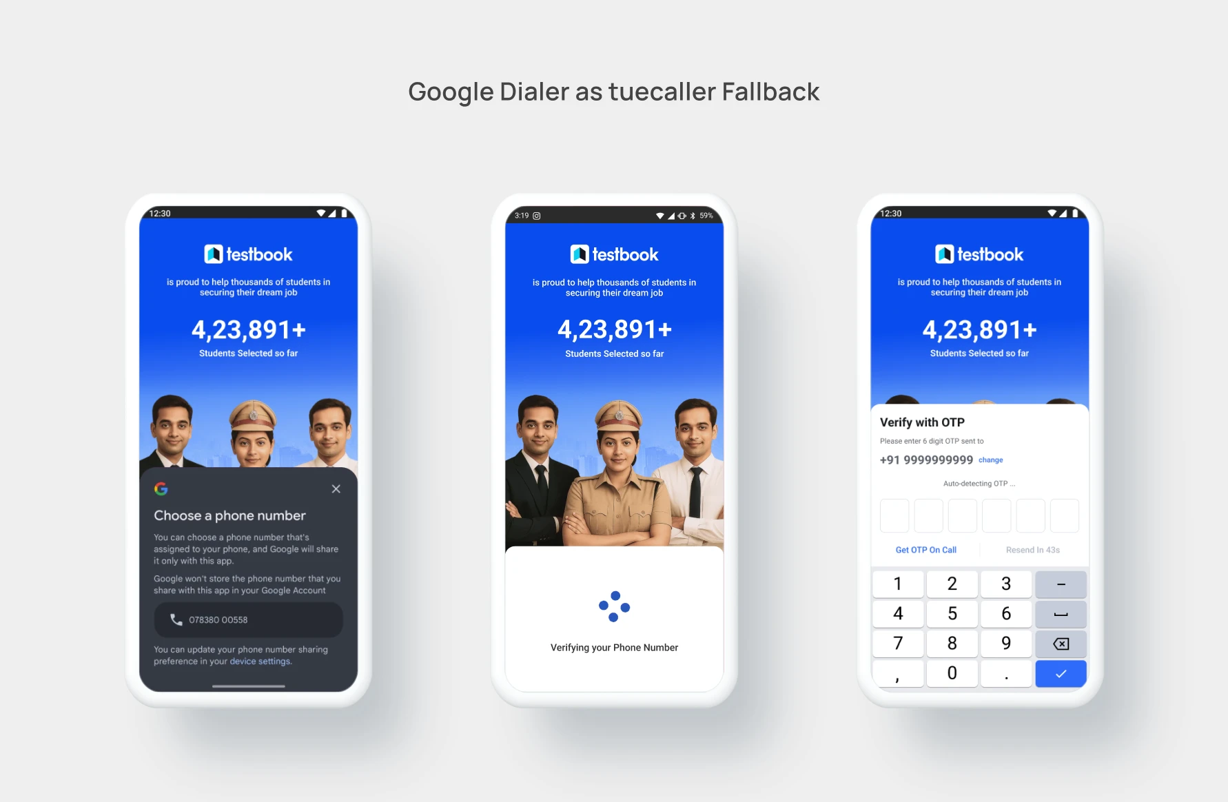
Designed fallbacks to ensure reliability:SNA (primary)
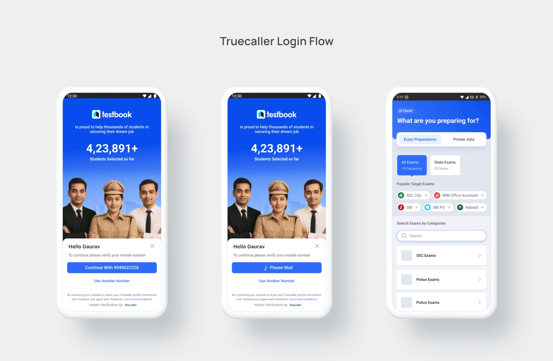
Truecaller / Google Dialer autofill
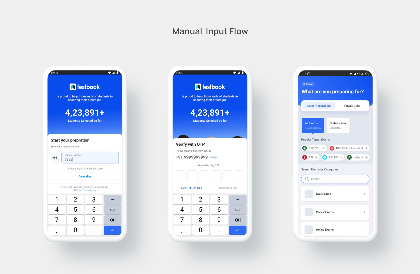
Manual OTP
Removed “Continue” Step
Auto progression on valid input reduced interaction costDynamic Auth Screen
Backend-controlled hero for contextual messaging
Authentication System - How SNA works
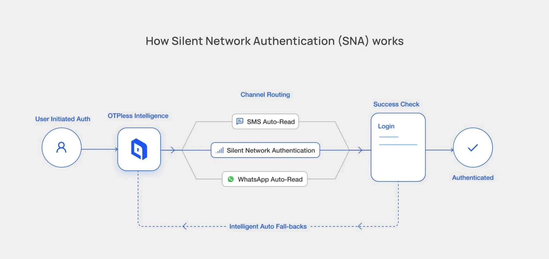
“Authentication is handled intelligently in the background using SNA, with fallback mechanisms ensuring reliability.”
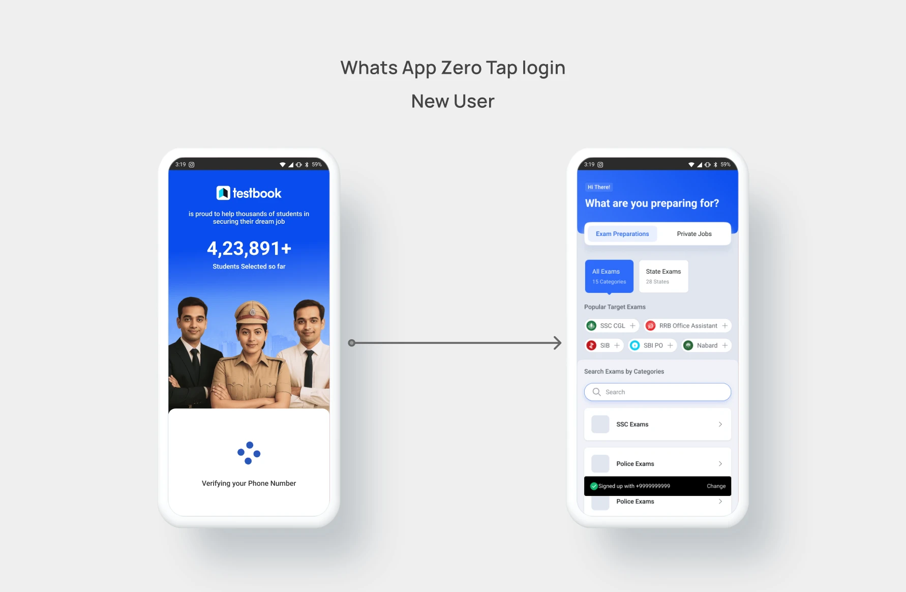
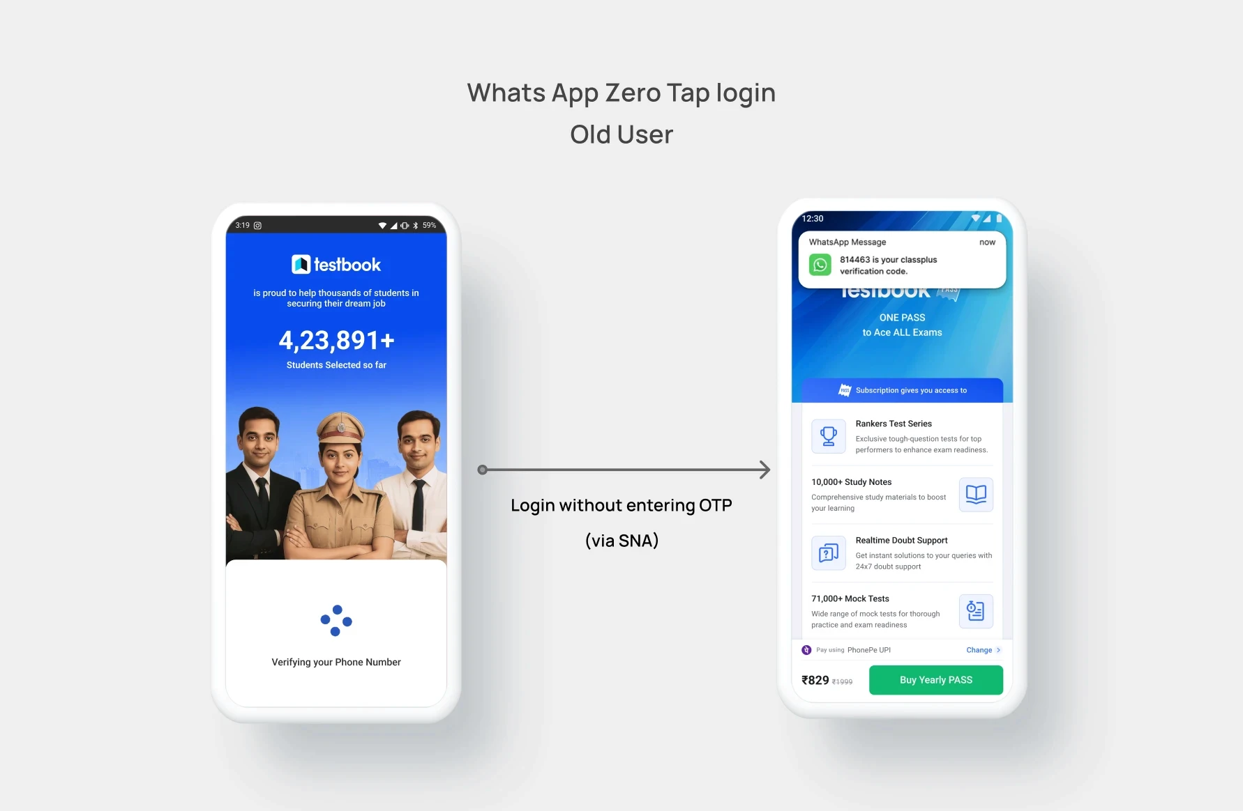
We reframed onboarding as:
A single, uninterrupted interaction between user intent and access
Instead of optimizing individual steps, we explored ways to eliminate friction across the entire experience.
Design Decisions
This led to a few key decisions:
Unified Login & Signup
Removed the distinction — users enter their number, system handles the restIntroduced SNA (OTPless)
Enabled silent, background authentication without OTPLayered Authentication System
Designed fallbacks to ensure reliability:SNA (primary)
Truecaller / Google Dialer autofill
Manual OTP
Removed “Continue” Step
Auto progression on valid input reduced interaction costDynamic Auth Screen
Backend-controlled hero for contextual messaging
Authentication System - How SNA works
“Authentication is handled intelligently in the background using SNA, with fallback mechanisms ensuring reliability.”
TEST
TEST
and Validate
and Validate
Internal testing with QA and beta users showed faster completion (avg. 4s faster), higher clarity, and positive feedback on simplicity.
FINAL
Designs
Hi- Fidelity
Hi- Fidelity
Design Mocks
Design Mocks
The final design brought visual focus to the number input field, streamlined typography, and subtle motion feedback to communicate verification progress.
The dynamic auth screen was designed to be lightweight and modular, allowing easy updates from the backend.
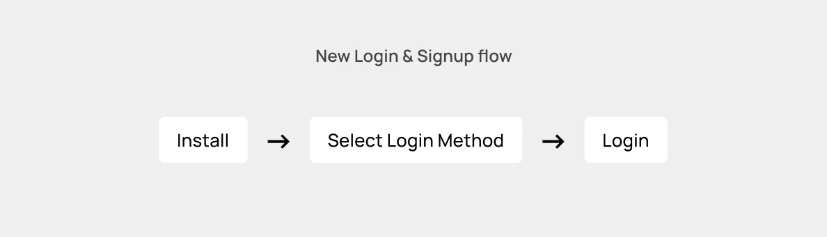
From Flow to Experience
Before
4–5 steps
Multiple decisions
Visible effort
After
1 continuous interaction
No decision points
Minimal user effort
Users moved from:
“What do I do next?”
to:
“I’m already in.”
The final design brought visual focus to the number input field, streamlined typography, and subtle motion feedback to communicate verification progress.
The dynamic auth screen was designed to be lightweight and modular, allowing easy updates from the backend.
From Flow to Experience
Before
4–5 steps
Multiple decisions
Visible effort
After
1 continuous interaction
No decision points
Minimal user effort
Users moved from:
“What do I do next?”
to:
“I’m already in.”

IMPACT &
Outcome
Impact
Impact
Created
Created
The new signup flow reduced the onboarding process from 4–5 steps to just 1, drastically improving speed and user experience.
Verified signups increased by ~10%.
Verification rate improved from 93% → 96%.
Signup drop-offs reduced significantly.
The dynamic hero image module also enabled the marketing team to update visuals seasonally without needing design/development changes.